Top Typography Tips for Print
Typography is more than just choosing fonts—it’s the art of arranging text in a way that enhances both readability and visual appeal. In print design, typography plays a crucial role in delivering clear communication, building brand identity, and guiding the reader’s eye through the page. Poor typography can confuse or overwhelm your audience, while strong typography brings structure, flow, and polish.
Whether you’re working on brochures, flyers, packaging, or business cards, applying the top typography tips for print will help you achieve professional and effective results.
1. Choose Print-Friendly Fonts
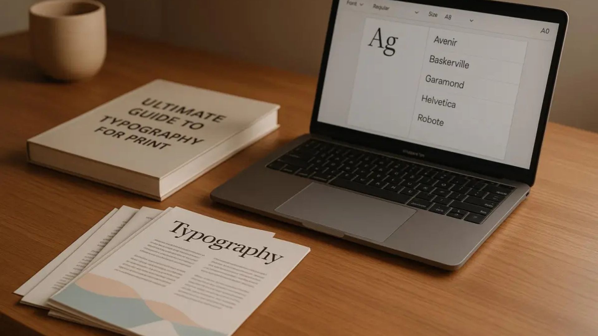
Not all fonts are suited for print. While some look great on screens, they may appear blurry, thin, or cluttered when printed. Choose fonts specifically designed for legibility in print.
Best practices:
- Use serif fonts (like Garamond or Times New Roman) for body text in formal or traditional designs
- Use sans-serif fonts (like Helvetica or Futura) for modern, clean looks
- Avoid overly decorative fonts for large blocks of text
For best results, test print a sample before finalizing your design.
2. Maintain a Clear Hierarchy
Typography should guide the reader naturally from the most important information to the least. Visual hierarchy helps prioritize content and make layouts easier to scan.
Ways to create hierarchy:
- Vary font sizes for headlines, subheads, and body text
- Use bold or italic styles to emphasize key points
- Add space between sections to visually separate ideas
Strong hierarchy makes your print materials look organized and intentional.
3. Limit Your Font Choices
Too many fonts in one design can lead to confusion and clutter. Simplicity is key.
Typography tip:
Stick to two fonts maximum—a primary typeface for headlines and a complementary one for body text. If needed, use variations (like bold or light) within the same font family for diversity without losing consistency.
Using fewer fonts also makes your design feel more cohesive and professional.
4. Use the Right Font Size
Font size affects both readability and emphasis. In print design, sizes need to account for both viewing distance and lighting conditions.
General guidelines:
- Body text: 10–12 pt
- Subheadings: 14–16 pt
- Headlines: 18 pt and up
- Captions or fine print: 8 pt minimum
Always print a test version to ensure the text is legible in real-world conditions.
5. Pay Attention to Leading, Tracking, and Kerning
These three spacing principles are essential to polished, professional typography:
- Leading (line spacing): Controls the space between lines of text. Too tight = hard to read; too loose = visually disconnected.
- Tracking (letter spacing): Adjusts the spacing uniformly across a word or sentence. Helpful for balancing white space in large headers.
- Kerning (individual letter spacing): Fine-tunes the space between specific letters for better visual balance.
Proper spacing makes your text easier to read and improves overall layout harmony.
6. Align Text Consistently
Text alignment affects how the reader’s eye moves through the design. In most print materials, left alignment is the most readable and natural for Western audiences.
Other alignment tips:
- Center alignment works well for headlines or short blocks of text
- Justified text can look neat in columns, but avoid large gaps between words
- Avoid switching alignment styles too often within the same layout
Consistency in alignment helps maintain a clean and professional appearance.
7. Choose Colors with Care
When using color in typography, make sure it enhances readability—not just aesthetics.
Tips for color use:
- Ensure high contrast between text and background (e.g., dark text on a light background)
- Use brand colors sparingly to highlight key sections
- Avoid neon or overly saturated colors that can be hard to read in print
Also, remember to work in CMYK color mode for accurate color reproduction in print.
8. Avoid Widows and Orphans
Widows and orphans are single lines of text left alone at the top or bottom of a paragraph or column, and they can make your layout look unbalanced.
How to avoid them:
- Manually adjust text breaks
- Tweak line spacing or font size slightly
- Rewrite content when necessary to maintain balance
Clean typography includes not just font choices but how the text physically sits on the page.
9. Use Styles and Paragraph Formatting
Styles in design software like Adobe InDesign or Illustrator help you maintain consistency across your entire print project. Define font choices, sizes, line spacing, and colors for:
- Headings
- Subheadings
- Body text
- Quotes or callouts
Using paragraph and character styles speeds up your workflow and ensures brand consistency.
10. Test Print Before Finalizing
What looks perfect on screen may not look the same when printed. Always print a sample at full size before approving the final version.
Why test printing matters:
- Confirms color accuracy
- Checks legibility of all text sizes
- Helps identify spacing or alignment issues
Test printing is one of the most essential typography tips for print—it protects your work and ensures the final product meets expectations.
Final Thoughts
Typography is a core element of every successful print design. By choosing the right fonts, maintaining consistent hierarchy, adjusting spacing, and ensuring print readability, you can create materials that look polished and communicate effectively.
These top typography tips for print will help you elevate your designs, enhance your brand message, and make a lasting impression on your audience. Typography may be subtle, but when used with intention, it becomes one of your strongest design tools.