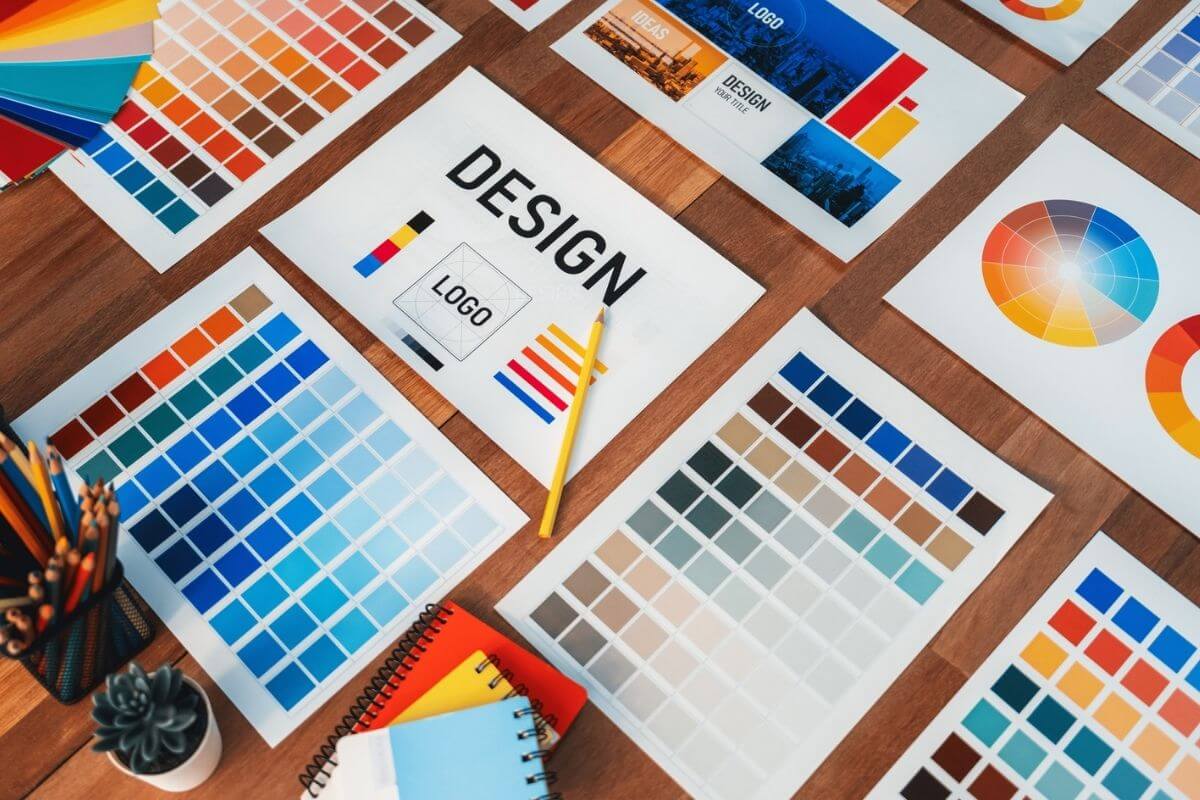
Top Print Design Layout Techniques
In the world of visual communication, layout is everything. Even the most beautiful design elements can fall flat if they aren’t arranged correctly. That’s where layout techniques come into play—ensuring your content is visually balanced, easy to read, and professionally presented. Whether you’re designing a brochure, flyer, business card, or magazine, understanding the top print design layout techniques can make or break your final product.
Here’s how to use layout strategies to elevate your print materials and leave a lasting impression.
Why Layout Matters in Print Design
A great layout does more than make a design look pretty. It serves a practical purpose by guiding the reader’s eye, emphasizing key messages, and creating visual harmony. Without a strong layout, even the most compelling content can go unnoticed or become difficult to understand.
Top print design layout techniques focus on structure, balance, and hierarchy—allowing your message to shine through clearly and confidently.
Use of Grids for Structure
One of the most foundational print design layout techniques is the grid system. Grids help designers create alignment and consistency throughout a piece, which is essential for both aesthetics and readability.
Types of grids include:
-
Column grids: Ideal for newspapers, magazines, and brochures
-
Modular grids: Great for product catalogs and data-heavy designs
-
Baseline grids: Help align text elements precisely
Using a grid ensures your layout has rhythm, making it easier for the viewer to digest content quickly and naturally.
Mastering Visual Hierarchy
Visual hierarchy is the order in which your audience processes the information in your design. It’s one of the most effective layout techniques because it helps highlight the most important elements first.
Ways to create hierarchy:
-
Size: Make headlines larger than body text
-
Weight: Use bold fonts for key messages
-
Color: Apply contrast to make important elements stand out
-
Spacing: Give focal points breathing room
A clear hierarchy ensures that readers don’t get lost or overwhelmed.
Leveraging White Space
Also known as negative space, white space refers to the areas of your layout left intentionally blank. Far from being wasted space, it actually enhances clarity, elegance, and focus.
Benefits of white space:
-
Increases readability
-
Creates visual breathing room
-
Emphasizes key elements
-
Helps the design feel uncluttered
Using white space wisely is one of the top print design layout techniques for a polished, professional look.
Creating Balance and Alignment
Balance in layout means distributing elements evenly, either symmetrically or asymmetrically, to avoid a design that feels lopsided or chaotic.
Balance types:
-
Symmetrical balance: Elements mirrored across a central axis
-
Asymmetrical balance: Uneven elements arranged to create harmony
Proper alignment, on the other hand, ensures all elements line up with each other, giving your layout a clean and organized feel. Misaligned items can appear amateurish and disrupt the reader’s experience.
Using Contrast to Draw Attention
Contrast helps separate different elements and direct the viewer’s focus. Whether it’s through typography, color, or shapes, contrast adds depth and interest to your design.
Examples of contrast:
-
Light text on a dark background
-
Serif fonts paired with sans-serif fonts
-
Thick vs. thin lines or borders
This layout technique is especially useful for calls to action, product highlights, or promotional content.
Applying the Rule of Thirds
Borrowed from photography, the rule of thirds is a compositional guideline that divides your page into nine equal sections using two vertical and two horizontal lines. Placing key elements along these lines or at their intersections creates a natural focal point.
This technique leads to dynamic, balanced layouts and helps your designs feel more organic and engaging rather than forced or overly rigid.
Typography as a Layout Tool
Typography isn’t just about choosing fonts—it’s a layout tool in itself. By varying font sizes, weights, line spacing, and alignment, you can structure content and improve readability.
Typography layout tips:
-
Use no more than two or three font styles
-
Keep line length between 50–75 characters for body text
-
Maintain consistent spacing between lines and paragraphs
When used properly, typography leads the eye through the content smoothly and keeps the reader engaged.
Consistent Margins and Padding
Margins and padding create the boundaries of your design. They give your content structure and ensure that text and images don’t run too close to the edges or each other.
Consistent spacing:
-
Frames your content cleanly
-
Prevents overcrowding
-
Adds a sense of professionalism
Many print designers follow specific margin guidelines based on the document type—for example, wider margins for books or tighter margins for posters.
Layering and Overlapping Elements
Layering text and images can create visual interest and a sense of depth. When done tastefully, overlapping elements can make a layout more dynamic and creative.
Use this layout technique sparingly to highlight key features or draw the eye to a specific area. Be careful to maintain legibility and avoid making the layout feel cluttered.
Final Thoughts
A strong layout is the foundation of any effective print design. By using the top print design layout techniques—such as grids, visual hierarchy, white space, contrast, and typography—you can create materials that look polished, feel balanced, and communicate your message clearly.
Whether you’re designing a brochure, flyer, poster, or product packaging, these layout techniques will help you craft visually compelling designs that resonate with your audience and reflect your brand’s quality. Investing in great layout isn’t just about aesthetics—it’s about results.