Responsive Design: Why It’s Essential in 2025
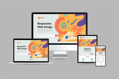
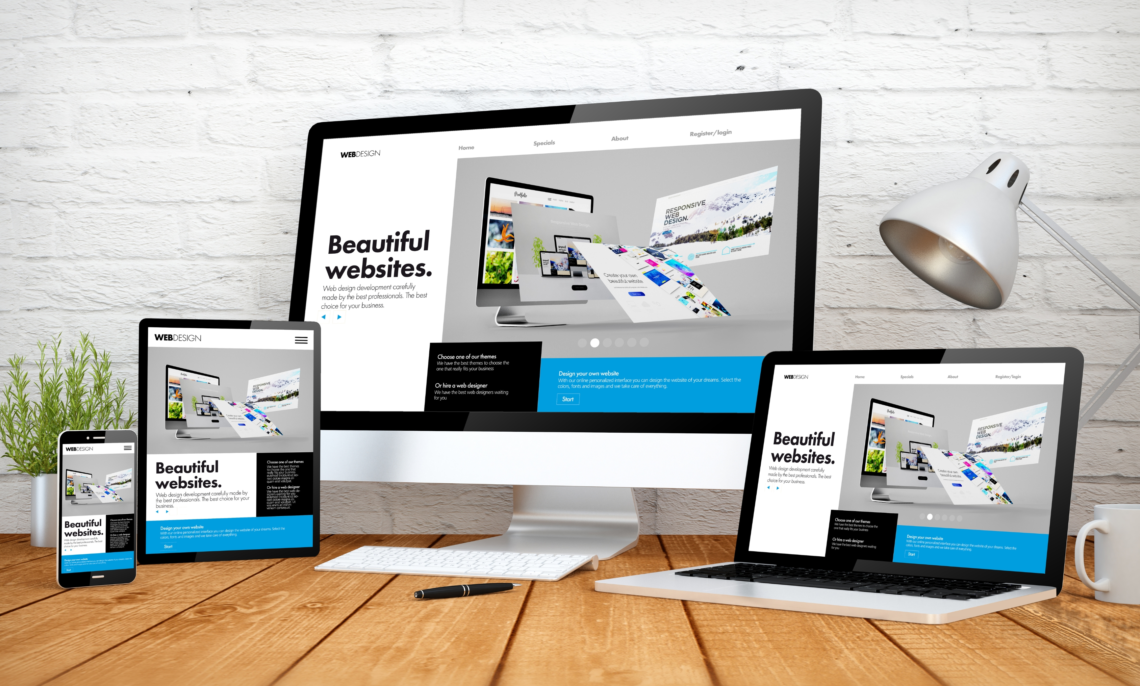
In 2025, responsive design is no longer optional—it is a necessity. With mobile devices accounting for the majority of web traffic, websites must adapt seamlessly to various screen sizes. Responsive design ensures that users enjoy a smooth, consistent experience whether they visit a website on a smartphone, tablet, or desktop.
Enhancing User Experience
User experience (UX) lies at the core of responsive design. Websites that adapt to screen sizes, orientations, and devices provide intuitive navigation, readable text, and functional elements.
A positive UX keeps visitors engaged, reduces bounce rates, and encourages return visits. By prioritizing responsive design, businesses ensure users can access information quickly and perform tasks effortlessly, enhancing overall satisfaction.
Mobile-First Approach
The mobile-first approach emphasizes designing for smaller screens before scaling up for desktops. Since smartphones are the primary browsing devices, this approach ensures that websites are optimized for the most common user scenarios.
By focusing on mobile-first design, developers prioritize essential content, simplify navigation, and optimize performance. This method improves usability and creates a solid foundation for responsive design across all devices.
Boosting SEO Performance
Search engines, particularly Google, prioritize mobile-friendly websites in their ranking algorithms. Responsive design directly impacts search engine optimization (SEO) and organic traffic.
Websites that load quickly, adapt to various screen sizes, and provide smooth navigation are rewarded with higher rankings. Businesses that neglect responsive design risk losing visibility and potential customers to competitors with mobile-optimized sites.
Faster Loading Times
Responsive websites often include optimized images, efficient coding, and streamlined layouts, which improve loading speeds. Fast-loading pages are essential for retaining visitors, especially on mobile networks where connectivity may vary.
Optimized performance not only enhances UX but also contributes to better SEO rankings. Users appreciate websites that load quickly, encouraging longer sessions and increased engagement.
Increased Accessibility and Reach
Responsive design ensures that websites are accessible across all devices, from smartphones and tablets to laptops and desktops. This flexibility allows businesses to reach wider audiences, catering to users regardless of their device preference.
Accessibility also aligns with inclusivity standards, ensuring that individuals with varying needs can interact with the website effectively. By designing responsively, businesses demonstrate commitment to user satisfaction and accessibility.
Reducing Maintenance and Development Costs
Maintaining separate desktop and mobile versions of a website can be costly and time-consuming. Responsive design consolidates all layouts into a single, adaptable website.
This approach reduces maintenance, simplifies updates, and ensures consistent branding and content across devices. Businesses save both time and resources while delivering a cohesive experience to users.
Adapting to Future Technologies
The digital landscape is constantly evolving, with new devices, screen sizes, and technologies emerging regularly. Responsive design provides the flexibility to adapt to future trends without requiring complete redesigns.
Flexible layouts and scalable elements allow websites to remain functional and visually appealing, regardless of technological advancements or new devices.
Conclusion
Responsive design is essential in 2025 for enhancing user experience, improving SEO performance, increasing accessibility, and reducing maintenance costs. By adopting a mobile-first approach, optimizing loading times, and creating flexible layouts, businesses can provide seamless experiences across devices.
Investing in responsive design ensures websites remain relevant, competitive, and user-friendly in a rapidly evolving digital environment. Companies that prioritize responsive design not only meet current user expectations but also position themselves for long-term success in the digital world.