How to Use Colors in Print Design
Color is one of the most powerful tools in print design. It grabs attention, evokes emotion, and shapes how your audience perceives your brand or message. But using color effectively goes beyond simply choosing shades that look good together—it requires an understanding of color theory, print processes, and design strategy.
Whether you’re designing business cards, brochures, packaging, or posters, mastering how to use colors in print design can elevate your work from good to unforgettable. Let’s break down the essentials.
Why Color Matters in Print Design
Color has the unique ability to influence how people feel, behave, and respond to visual content. In print design, it plays a key role in:
- Creating visual hierarchy
- Reinforcing brand identity
- Improving readability
- Setting the mood or tone
- Increasing engagement
When used with intention, color can enhance clarity, highlight important elements, and make your printed materials stand out from the rest.
Understand the Basics of Color Theory
Before diving into your palette, it’s important to know how colors interact. Color theory is the foundation of all visual design and helps you create harmony and contrast effectively.
The Color Wheel
The color wheel is made up of:
- Primary colors: Red, blue, yellow
- Secondary colors: Green, orange, purple (created by mixing primaries)
- Tertiary colors: Mixtures of primary and secondary colors
Key Color Schemes
Use these schemes to guide your design choices:
- Complementary: Colors opposite each other on the wheel (e.g., blue and orange). Great for strong contrast.
- Analogous: Colors next to each other (e.g., blue, blue-green, green). Offers a more harmonious, natural feel.
- Monochromatic: Variations of a single color. Clean and minimalist.
- Triadic: Three colors evenly spaced on the wheel (e.g., red, yellow, blue). Balanced and vibrant.
Choosing the right scheme ensures your design feels cohesive and visually appealing.
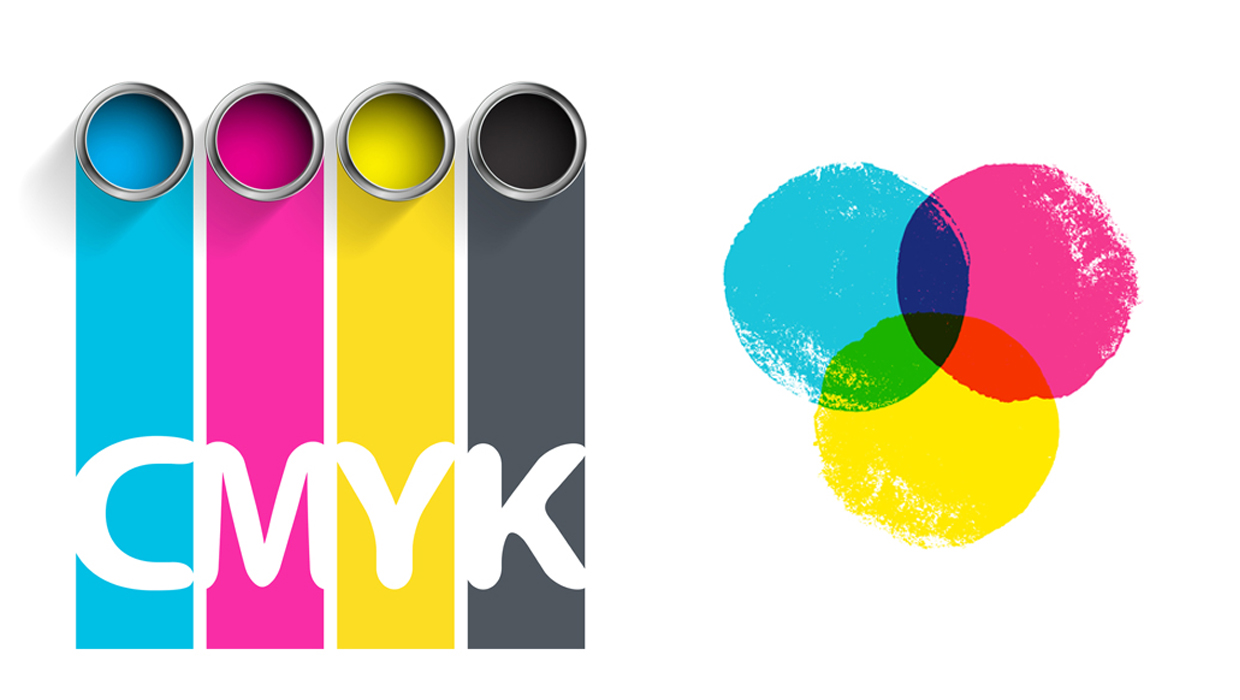
Work Within the CMYK Color Model
In digital design, we use RGB (red, green, blue) for screens. But for print, CMYK—cyan, magenta, yellow, and black—is the industry standard. Printers mix these four inks to produce full-color prints.
Tips for working with CMYK:
- Design your projects in CMYK mode from the start to ensure color accuracy.
- Know that some bright RGB colors (especially neons) may not reproduce well in print.
- Always review print proofs before finalizing large batches.
Understanding how your colors will appear in print avoids unwanted surprises and ensures professional results.
Use Brand Colors Consistently
If you’re designing for a brand, always follow the official brand color guidelines. Consistency builds trust and recognition.
How to apply brand colors effectively:
- Use the brand’s primary color for key elements like headlines or backgrounds.
- Use secondary or accent colors sparingly to add visual interest.
- Ensure enough contrast between background and text for readability.
If you don’t have a formal brand palette, consider creating one to guide all future print designs.
Create Hierarchy with Color
Color is an excellent way to organize information and guide the reader’s eye.
Strategies include:
- Highlight important elements with a bold or contrasting color.
- Group related content using similar shades.
- Use muted tones for background areas and bright colors for focal points.
Be intentional—too many colors can overwhelm the reader, while strategic use can improve clarity and engagement.
Consider Emotional and Cultural Impact
Colors carry different meanings depending on cultural and emotional context. For example:
- Red: Excitement, passion, urgency (but also warning or danger)
- Blue: Trust, calm, professionalism
- Green: Nature, health, growth
- Yellow: Optimism, happiness, attention-grabbing
- Black: Luxury, power, sophistication
- White: Purity, simplicity, cleanliness
Always consider your target audience and the message you want to convey when selecting colors.
Balance Color with Neutral Tones
While vibrant colors are eye-catching, neutral tones like white, black, gray, and beige help balance the design and prevent visual overload.
Neutral colors serve to:
- Let primary colors stand out
- Provide visual rest areas
- Maintain a clean, professional look
Use neutral backgrounds or dividers to help organize content and make important elements pop.
Ensure Readability with High Contrast
When it comes to text, contrast is crucial. Poor contrast can make even the best designs hard to read.
Tips for readability:
- Use dark text on light backgrounds and vice versa.
- Avoid placing text over complex or colorful images.
- Use a contrast checker if you’re unsure whether your color choices are accessible.
Especially for print materials like brochures or posters viewed from a distance, high contrast improves legibility and effectiveness.
Use Spot Colors When Necessary
Spot colors are pre-mixed inks used to achieve exact color matches, especially for logos or when printing with metallics or fluorescents.
When to use spot colors:
- To maintain precise brand color consistency
- For special effects like gold foil or neon
- On packaging or labels that require color accuracy
Keep in mind that using spot colors may increase printing costs but can be worthwhile for premium designs.
Final Thoughts
Knowing how to use colors in print design is about more than just aesthetics—it’s about purpose, psychology, and precision. From selecting the right color scheme to working in CMYK and maintaining contrast, thoughtful color choices can elevate your designs, communicate your message effectively, and ensure your print materials leave a lasting impression.
By applying these principles, you’ll not only enhance your visual impact but also strengthen your brand identity and connect with your audience in more meaningful ways.