Creative Website Layouts That Drive Conversions
Your website layouts are the foundation of your online success. A creative, well-structured layout not only grabs attention but also guides visitors toward taking action—whether that means making a purchase, signing up, or getting in touch.
In today’s competitive online world, creativity and strategy must work together. A visually appealing site without a clear structure may look great but fail to convert. Meanwhile, a dull layout with no personality might bore visitors before they reach your content. The key is to strike the perfect balance.
Why Layout Matters for Conversions
Your website’s layout affects how users experience your brand. The way elements are arranged—text, images, buttons, and menus—directly influences user decisions. A creative yet functional design helps visitors find what they need quickly and encourages them to act.
Studies show that users form an opinion about a website in just seconds. If your layout feels confusing or cluttered, they’ll leave before exploring further. But a well-designed layout builds trust, improves engagement, and boosts conversion rates.
Essential Principles of a High-Converting Layout
Before diving into creative ideas, it’s important to understand the fundamentals of effective design. Every high-performing layout includes these principles:
-
Visual Hierarchy—Arrange elements to highlight what matters most. Larger fonts, bold colors, and strategic positioning draw attention to key information.
-
Whitespace—Empty space around text and visuals helps reduce clutter and increases readability.
-
Consistent Branding—Fonts, colors, and imagery should reflect your brand’s identity across all pages.
-
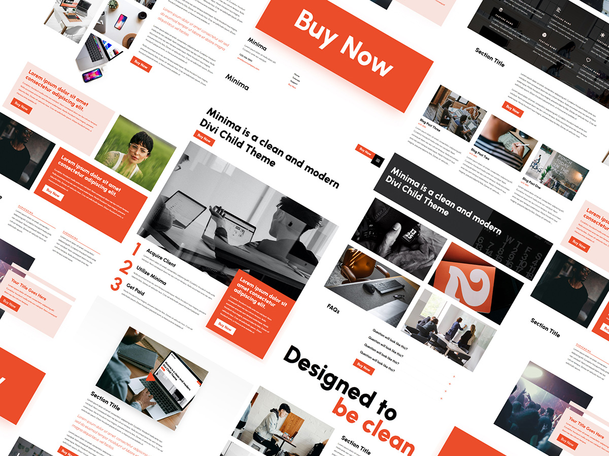
Clear Calls-to-Action (CTAs) – Buttons like “Buy Now” or “Get Started” should be visible and compelling.
-
Responsive Design—The layout must adapt seamlessly to mobile, tablet, and desktop screens.
Once you’ve mastered these basics, you can introduce creative touches that make your layout stand out.
Creative Website Layout Ideas That Convert
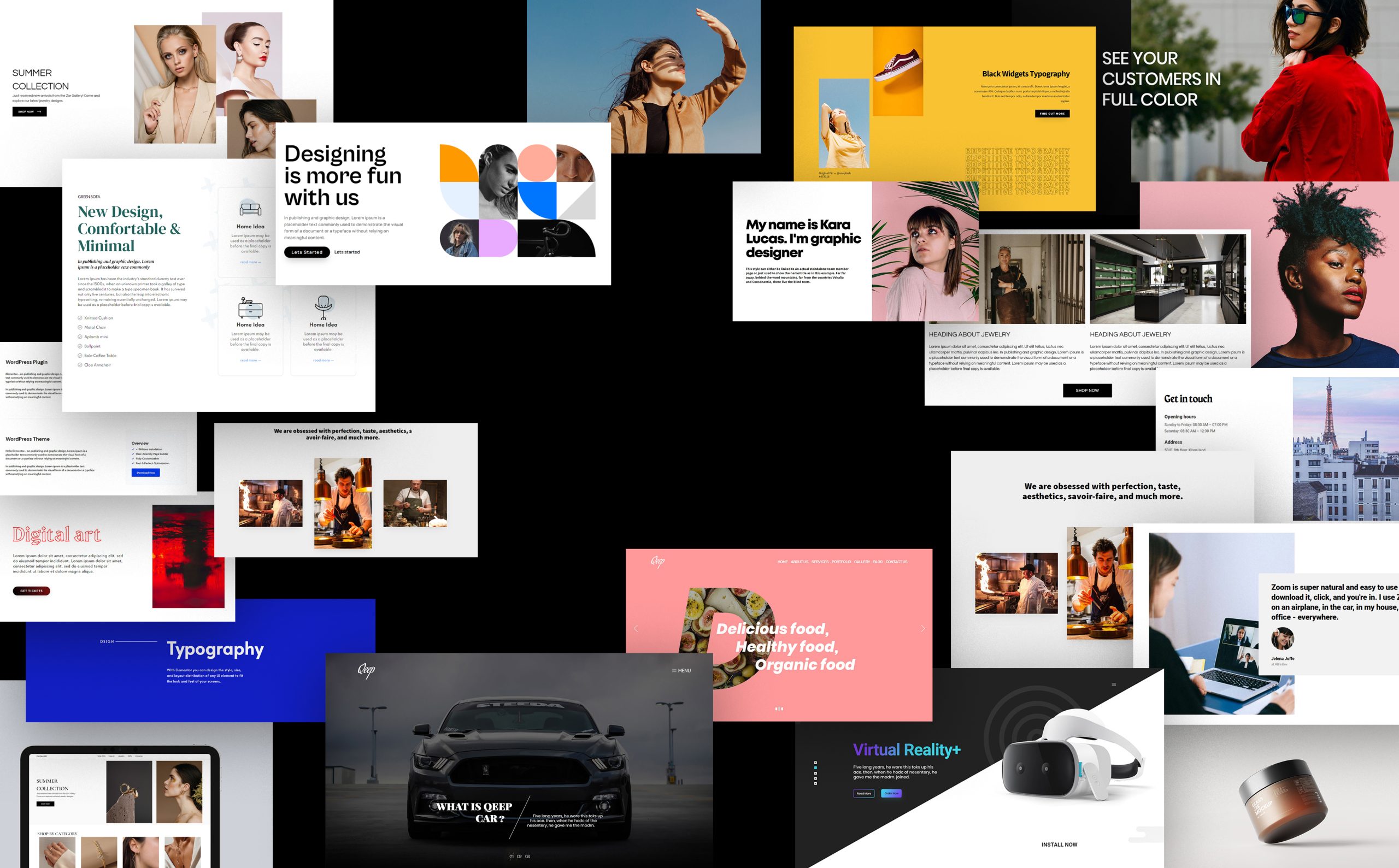
1. Split-Screen Layouts
A split-screen design divides the page into two halves, allowing you to showcase contrasting ideas or products side by side. For example, one side can display visuals while the other highlights a call to action. This approach works well for product comparisons, service options, or storytelling pages.
2. Asymmetrical Grids
Perfect symmetry can look predictable. Asymmetrical layouts, on the other hand, feel dynamic and modern. They draw attention to key areas while keeping visitors curious. The trick is to maintain visual balance while breaking away from traditional grid systems.
3. Bold Hero Sections
Your homepage hero section is your first impression. Use bold imagery, clear headlines, and engaging animations to immediately communicate your message. A strong hero layout captures attention and sets the tone for the rest of the site.
4. Interactive Scrolling
Interactive elements like parallax scrolling or animation-triggered effects make browsing feel immersive. These features encourage visitors to scroll further and stay longer. When used sparingly, they enhance storytelling and guide users smoothly toward conversion points.
5. Modular Layouts
Modular or card-based layouts—like those used on Pinterest—present content in digestible sections. This design helps users skim easily while maintaining order. It’s ideal for blogs, portfolios, and e-commerce stores showcasing multiple items.
6. Minimalist Design with Strong CTAs
Less can truly be more. A minimalist layout removes distractions and directs users toward one clear action. Strategic placement of bold buttons or short sign-up forms ensures your CTAs stand out without overwhelming the page.
Optimizing Your Layout for Higher Conversions
Creativity is powerful, but conversion-driven design is strategic. To turn visitors into customers, apply these optimization tactics:
-
Prioritize Above-the-Fold Content: Key messages and CTAs should appear before users scroll.
-
Use F-Shaped Reading Patterns: Studies show users scan pages in an “F” shape—align your layout accordingly.
-
Highlight Social Proof: Testimonials, ratings, and reviews build trust when placed near CTAs.
-
Simplify Forms: Shorter forms reduce friction and increase sign-ups.
-
Add Visual Cues: Arrows, color contrasts, and movement can subtly guide users toward conversion areas.
Testing is equally important. Use heatmaps and A/B tests to see which layout elements perform best.
Common Mistakes to Avoid
Even creative designs can fail if usability is ignored. Avoid these pitfalls:
-
Overusing animations or graphics that slow the site.
-
Using too many fonts or colors that confuse the user.
-
Hiding CTAs within cluttered designs.
-
Ignoring mobile responsiveness.
Your creativity should enhance functionality—not replace it.
Final Thoughts
Creative website layouts aren’t just about aesthetics—they’re about creating experiences that inspire action. When design and usability work together, your website becomes more than a digital brochure; it becomes a conversion engine.
Focus on clear structure, mobile responsiveness, and strategic CTAs. Experiment with modern layouts like split screens, modular grids, and bold hero sections to showcase your brand’s personality.
By improving how your website looks and how users interact with it, you’ll see higher engagement, more trust, and ultimately, more conversions. A creative layout done right doesn’t just attract visitors—it motivates them to take the next step with your brand.