
Choosing the Right Fonts and Colors for Print
Print design requires careful consideration of fonts and colors to ensure your materials are visually appealing, readable, and consistent with your brand. Selecting the right combination enhances communication, strengthens brand identity, and captures the attention of your audience.
Importance of Fonts in Print Design
Fonts communicate more than just words; they convey tone, style, and personality. Choosing the right font affects readability and audience perception.
Serif fonts, like Times New Roman or Garamond, convey tradition, elegance, and reliability. Sans-serif fonts, such as Arial or Helvetica, appear modern, clean, and approachable. Display fonts can add creativity but should be used sparingly to avoid clutter.
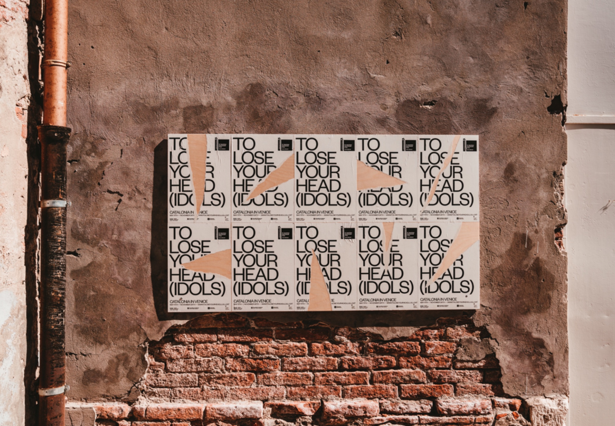
Pairing Fonts Effectively
Combining fonts enhances visual hierarchy and readability. Use a maximum of two or three complementary fonts to maintain clarity.
For example, pair a bold sans-serif headline with a simple serif body text. Avoid fonts that clash or are too similar, as they can confuse readers and weaken your design. Effective font pairing guides the reader through the content naturally.
Font Size and Readability
Font size impacts how easily your audience can read your materials. Headlines should be larger and prominent, while body text should be comfortable to read without straining the eyes.
Consider viewing your design from a distance to ensure readability, especially for posters, flyers, or signage. Adjust spacing and line height to further improve clarity and visual flow.
Color Psychology in Print
Colors influence perception and emotions. Understanding color psychology helps communicate your message effectively.
Warm colors, like red and orange, evoke energy, excitement, and urgency. Cool colors, such as blue and green, convey calm, trust, and professionalism. Using the right colors aligns your print materials with the intended message and audience response.
Contrast for Visibility
High contrast between text and background enhances readability. Dark text on a light background or light text on a dark background ensures that the content is easily visible.
Contrast also highlights important elements, such as headings, calls-to-action, and key visuals. Proper contrast prevents your materials from appearing flat or difficult to read.
Maintaining Brand Consistency
Fonts and colors should align with your brand identity. Consistent use of your brand’s typography and color palette reinforces recognition and builds trust.
Before selecting fonts and colors, consult your brand guidelines. Consistency across all printed materials creates a professional and cohesive look.
Consider Printing Limitations
Print materials differ from digital displays. Colors may appear differently on paper due to ink and paper types. Use CMYK color mode for accurate print colors and select fonts that maintain readability when printed.
Additionally, test print samples to check color vibrancy and font legibility. Understanding printing limitations ensures your design translates well from screen to physical materials.
Use Accent Colors Wisely
Accent colors draw attention to key information or design elements. Use them for headlines, buttons, or important visuals without overwhelming the overall design.
Balancing accent colors with primary brand colors creates visual interest while maintaining harmony. Strategic use of color enhances engagement and guides the reader’s eye.
Test and Refine Your Choices
Always review and test your fonts and colors before finalizing your print materials. Seek feedback from colleagues or potential audience members to ensure readability, visual appeal, and alignment with your brand message.
Refining font and color choices based on feedback results in print materials that communicate effectively and resonate with your audience.
Conclusion
Choosing the right fonts and colors for print is essential for creating impactful, readable, and visually appealing materials. Effective font selection, pairing, sizing, and spacing enhance readability, while thoughtful color choices and contrast reinforce your message and brand identity.
By considering font personality, color psychology, brand consistency, and print limitations, businesses can produce printed materials that capture attention, engage audiences, and leave a lasting impression. Combining creativity with strategy ensures that every print piece communicates clearly and strengthens your brand presence.